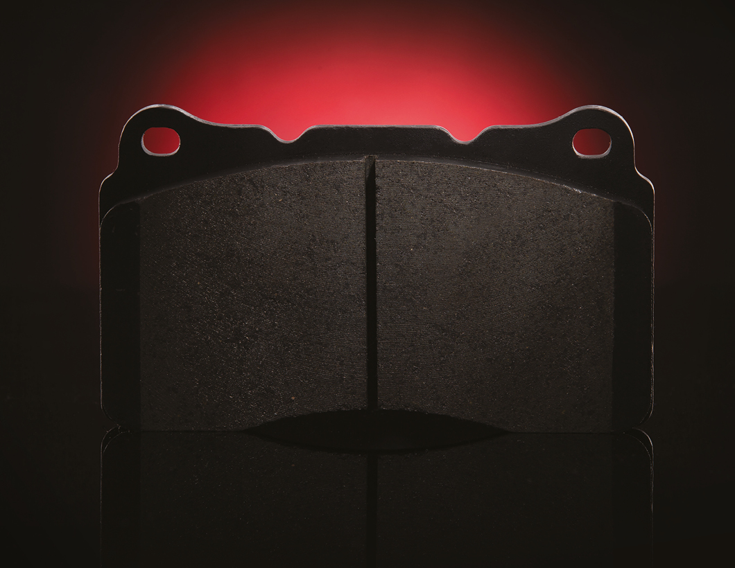
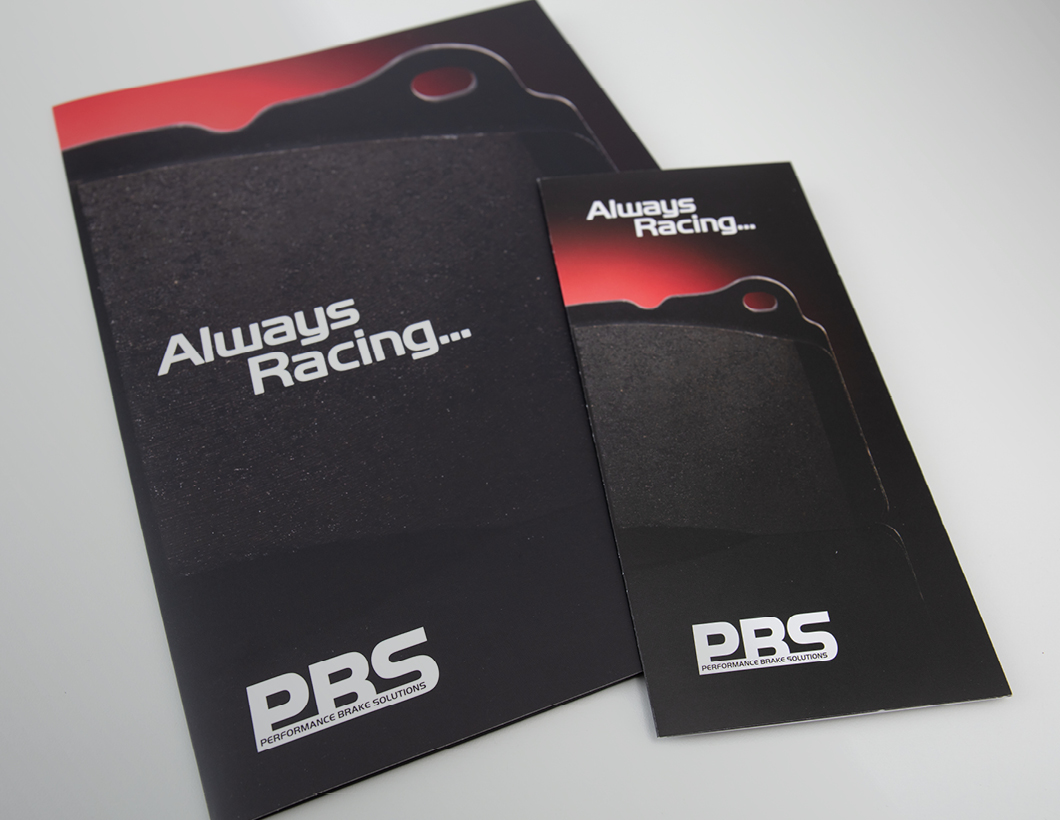
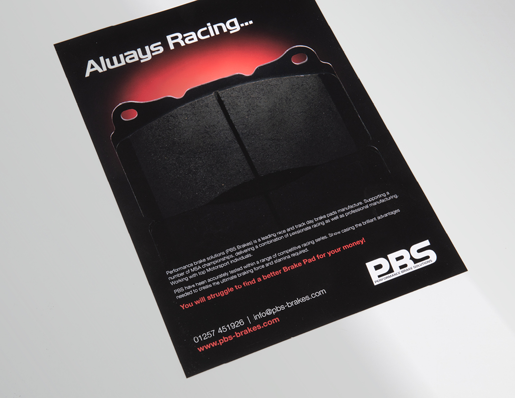
We have been working with our friends at Matt Bristow Photography to develop an identity for PBS Brakes. Their logo already existed, but how could we make the actual brake pad products look more ‘sexy’, update the branding and attract more interest in a competitive market?
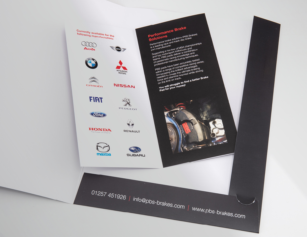
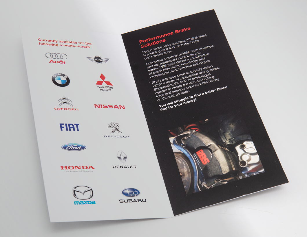
We developed a photographic style reminiscent of aspirational car photography, using close ups and stark contrast in lighting to focus on details of the brake pads. We also used the red colour of their branding to highlight the product. Keeping the colours minimal makes the branding jump out and the photography style demands a closer look. We have currently successfully applied this look and feel to adverts, a folder and leaflets.
