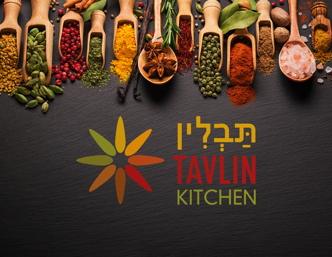
We’ve started the year with another nice branding project, this time for Tavlin Kitchen. It is a start-up business and we worked with chef Tomer to develop a brand which shows the vibrant colours of his homeland of Israel.
Tavlin translates as ‘Spice’ and the colours represent the herbs and spices in the markets. The shape itself was inspired by star anise but also reflects the sun and hot colours of israel.
You can find out more on his Facebook page – the website is currently under development.